
THE PROBLEM:
New and existing users had difficulty setting up and managing a hierarchical structure when they purchased our LMS. The Hierarchy page was not intuitive, lacked directions, and functionally became unwieldy in larger organizations with many departments and sub-hierarchy structures. Research and Design partnered on this project. Design built prototypes and Research conducted Round One of Usability Tests.
The Hierarchy Page in the platform was designed to allow our customers to build out their organizational structure. This process, which should be completed as part of their onboarding, allows administrators to identify personnel, departments, and create groupings that can be used to bulk assign trainings. This platform page and process was often skipped altogether, was not being managed effectively, and was providing little benefit to some of our users. If we could solve some of the pain points associated with this page and process, our customers could better manage their groupings, and more effectively assign training to groups and departments.
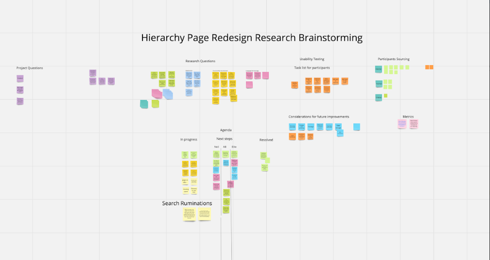
I initially hosted a kickoff call with the stakeholders where we identified user challenges. The Product Management Team, the UX Designer, and myself met regularly over the span of several months to identify the pain points, brainstorm solutions, review design frames, and drive progress. I hosted and documented these meetings using a Miro board to organize our ideas, follow up action items, and keep research aligned with the project.
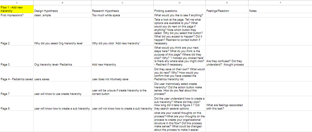
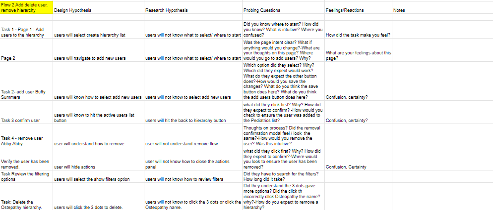
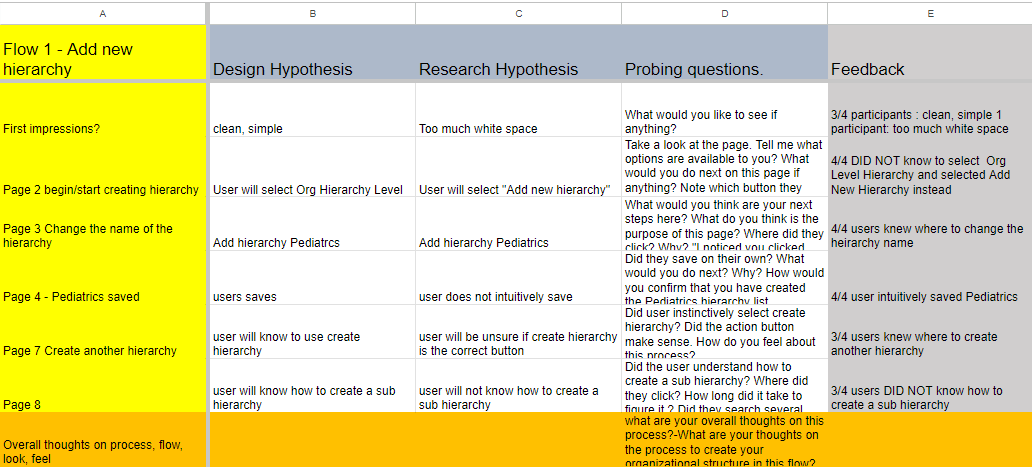
Once we had agreement on pain points to tackle, workflows, design frames, and prototypes, I launched Usability Studies in a platform called Userlytics with four of our internal UX designers. (This was a great opportunity to get feedback on usability, accessibility, and design challenges.) I built a prototype workflow script and a spreadsheet to capture the actions and feedback from participants in the study. Round one of testing included four participants and each participant was asked to complete a series of tasks in the prototypes.
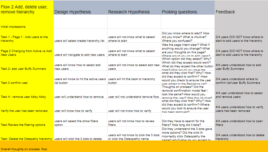
I used spreadsheets to build the flow, tasks, and questions to be used in the usability testing. I also aimed to capture their action responses to the questions, their feelings, and any additional notes. I then compiled the results to report back to the stakeholders.

The Usability testing identified some concerns in the prototypes. Based on the results of the findings, the UX Designer was able to make some adjustments to the prototypes. Round Two of research with the amended prototypes commenced with participants from our user population.
Can we alleviate the pain points--the answer was yes, but with a little more work. Round Two of the research was conducted with platform customers who lended even more insights about their workflow and expectations. Work was ongoing with this project.
While this report focused on the qualitative data and findings, this project also contained quantitative data that could have been better illustrated with additional graphics in the final report.
I learned that using our UX Designers for the initial round of prototype testing was a great practice. It allowed us to use "design eyes" to spot concerns that our user base may or may not have noticed. It was a great way to ensure we met our standards for accessibility, design patterns, errors in the functionality of the prototypes, and aesthetics. The trial process of testing with our UX Designers went well and was to become a standard practice going forward.

